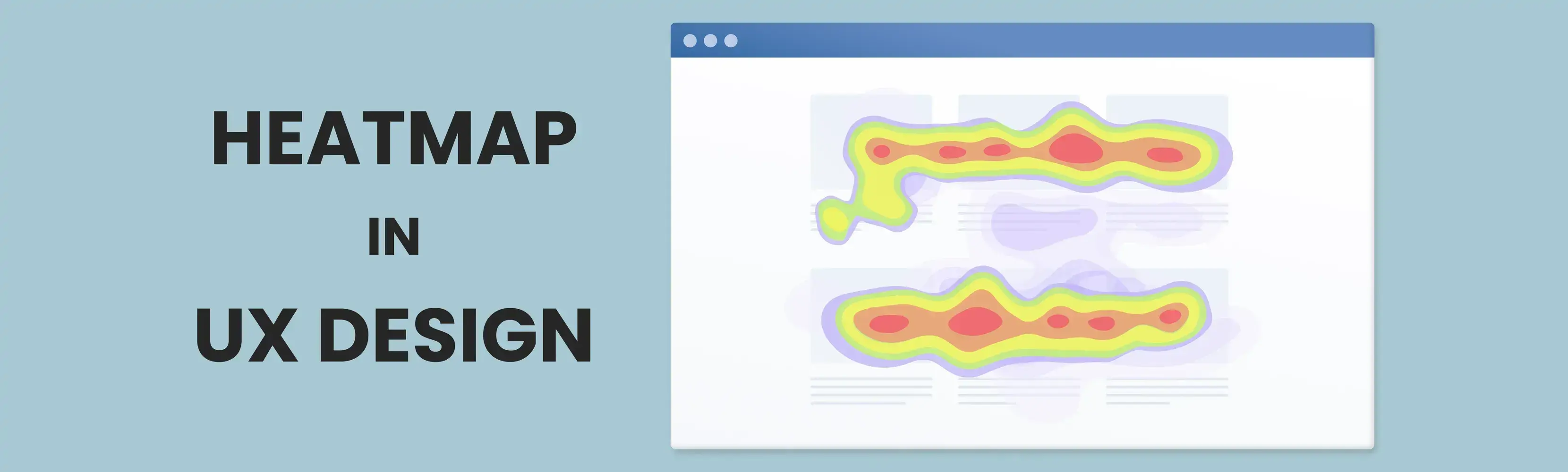
The role of heatmaps in UX design
One of the pressing issues in this age is to keep a user’s attention, which requires an excellent user experience (UX) design. Websites, mobile applications, and other digital platforms must understand users and their actions to succeed. However, the question remains: how do UX designers know how exactly users interact with their products? The answer is heatmaps.
Heatmaps are UX analytics methods that capture user interaction on a web page or application. They show patterns of crucial clicks, hovers, and scrolls. Each UX designer should track these actions because they are essential in crafting a design strategy.
In this blog, we will analyze:
- The types of heatmaps and their usage.
- The role of heatmaps in UX design.
- The leading heatmap websites.
By the end of this blog, you’ll be equipped with the information on heatmaps that will allow you to maximize your efforts in UX optimization strategies
What are Heatmaps?
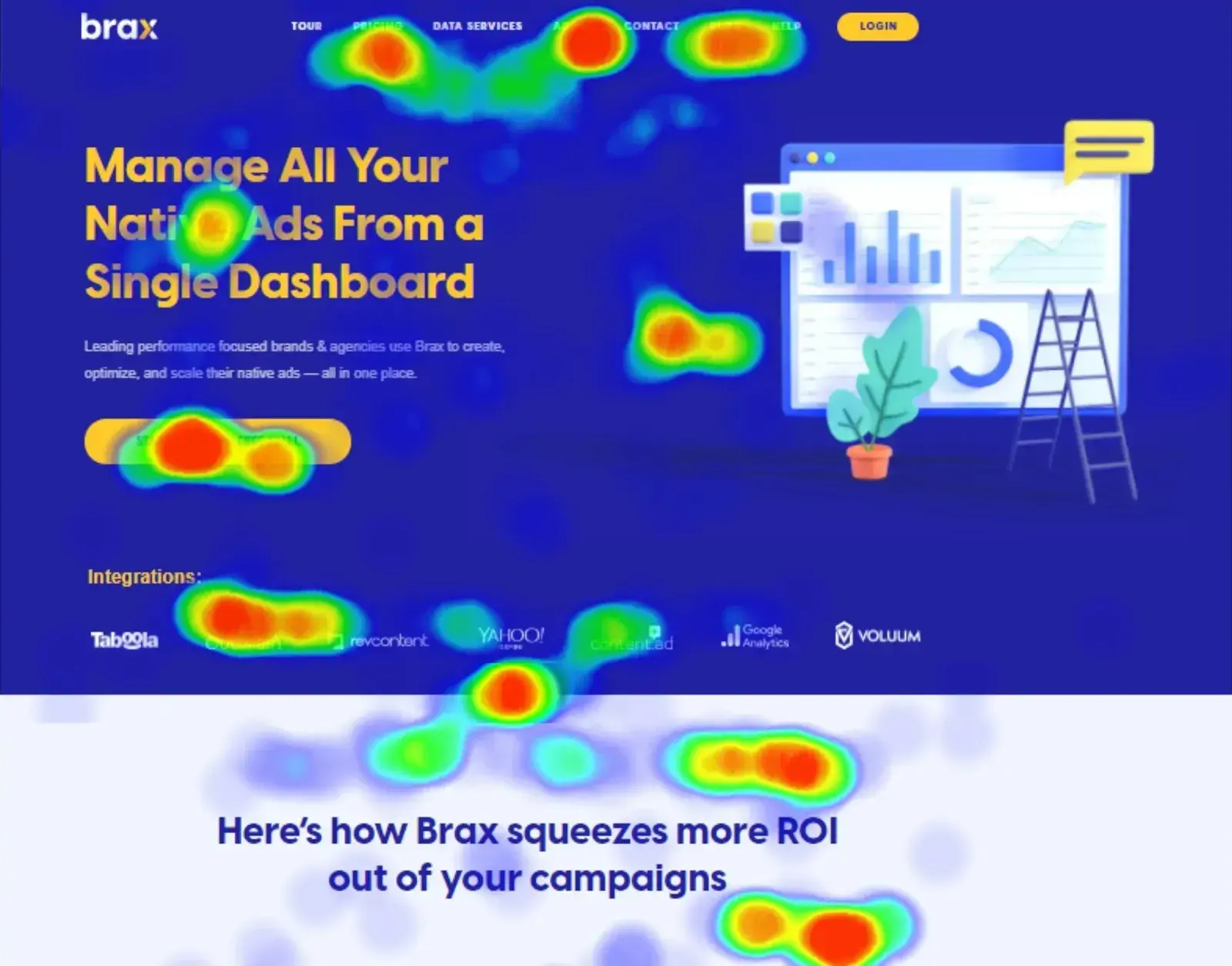
Heatmaps show data where the individual values are depicted in colors. It is useful in tracking the user interaction with a particular website or application. In UX design, heatmaps are used to illustrate user engagement on a certain site or an application.
The color gradient in heatmaps:
- Warm colors (red, orange, and yellow) indicate areas of great user interaction, such as increased clicks and intense scrolling.
- Cool colors (blue and green): Areas of low engagement.
Types of Heat maps
Each type of heatmaps provides distinct benefits of their own. They can be listed as follows:
1. Click Maps
These heatmaps represent the clicks that users make on a webpage. They determine the level of interest in certain elements such as buttons, links, and images. For example, it is crucial to identify areas where visitors might encounter friction, such as non-clickable elements that they expect to be interactive. By removing or optimizing areas causing friction, you can improve the overall experience on your website.
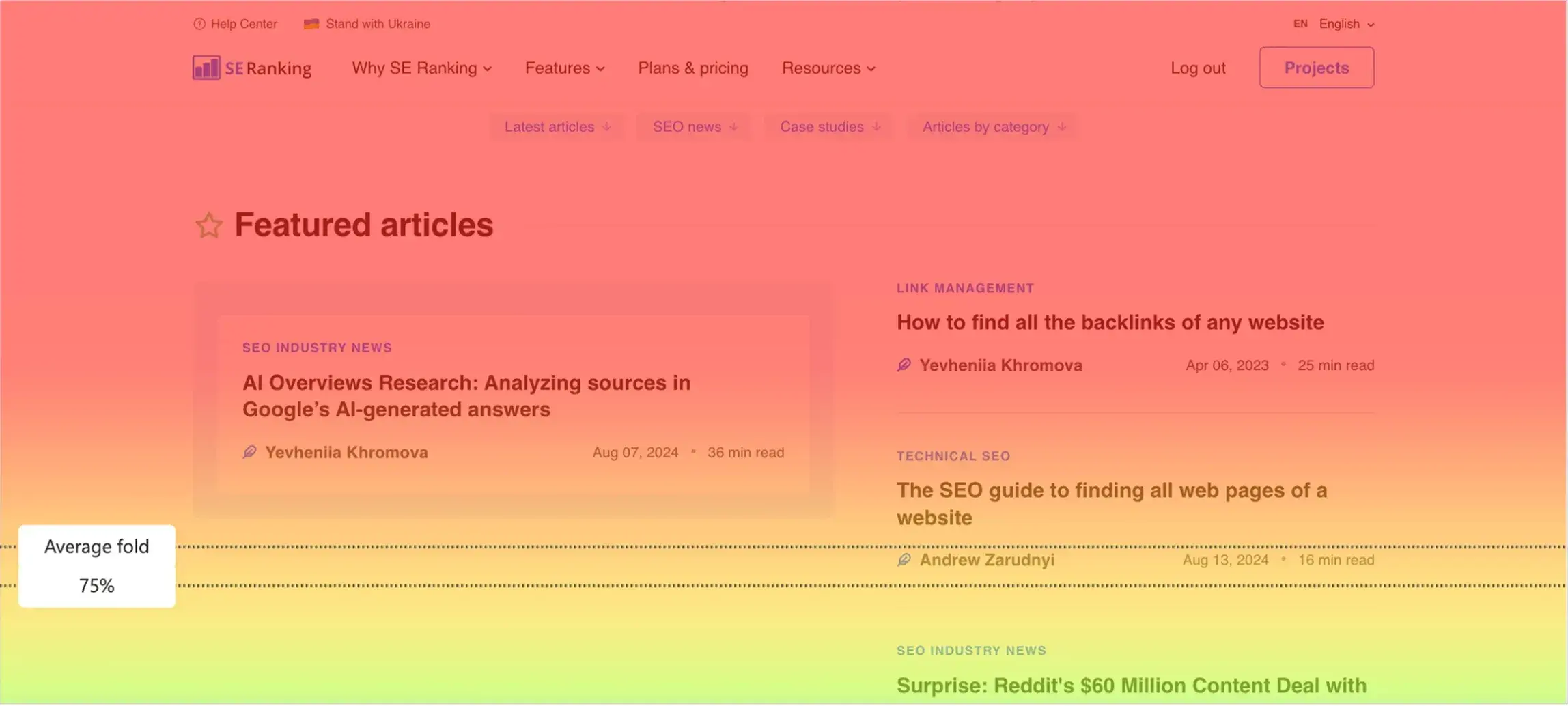
2. Scroll Maps
Scroll maps display users scrolling down the page to reveal how far down the users have scrolled. Noticing that users are dropping off before important information like a call to action or a key piece of content suggests that the page needs to be reorganized so that these facets are above the fold.
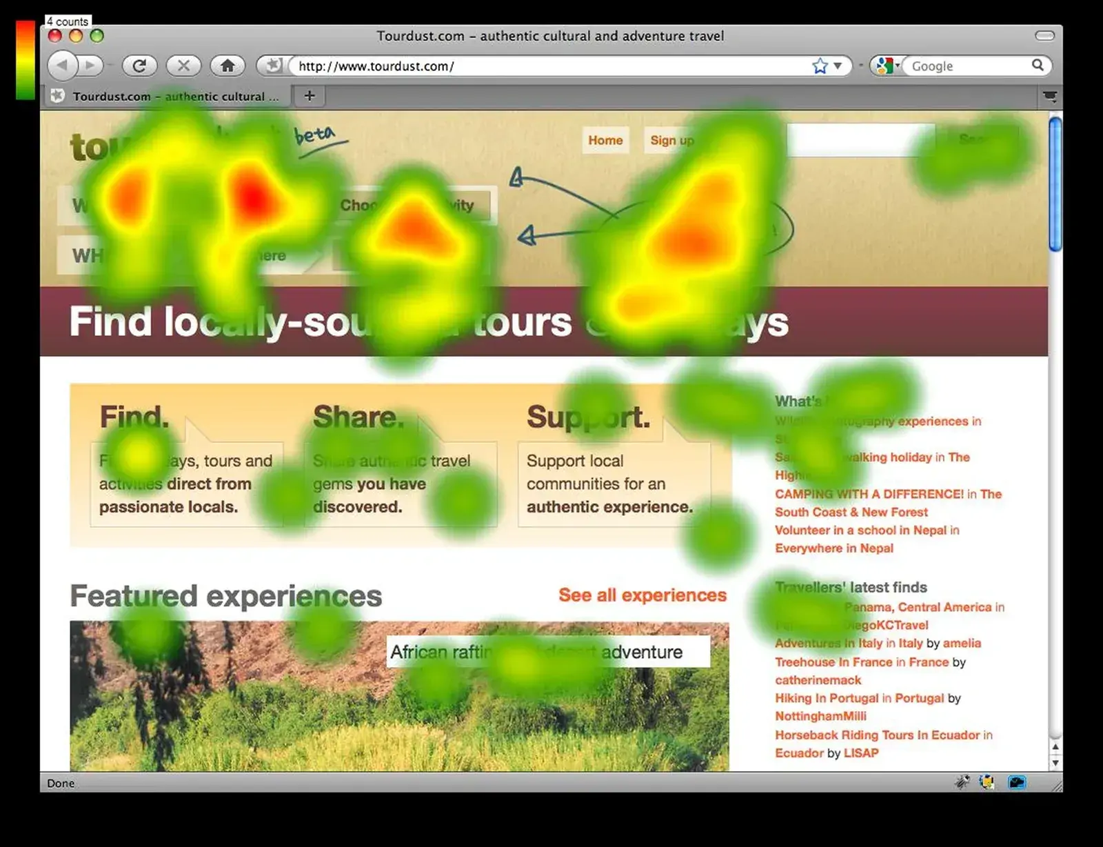
3. Mouse Maps
These maps record the movement of the cursor revealing where users are hovering or which sections are getting focused on. They are not as accurate as eye-tracking tools, but they can serve a similar purpose and are much more affordable, therefore showing attention distribution with approximation.
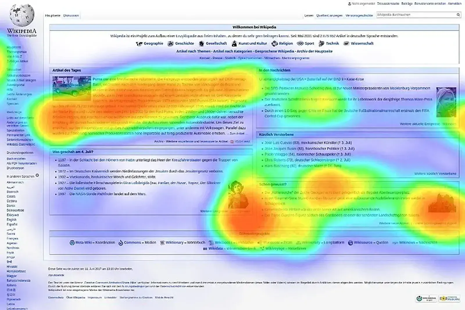
4. Eye-tracking Maps
These maps offer a deeper level of user interaction by using cameras and software that can detect where the user’s attention is directed to on every single page, and the manner in which people move their eyes towards the page information.
5. Attention Maps
Attention heatmaps measure how users focus on different parts of a screen by tracking how long and how intensely they interact with specific areas. This tool is valuable for understanding whether key content, such as images, videos, or calls to action, is effectively capturing user interest.
6. Engagement Maps
These heatmaps provide a complete picture of how users interact with an app or website by combining data from multiple sources, such as clicks, scrolls, and time spent on specific elements. For example, they can reveal whether users are interacting with important buttons, spending time on key content, or abandoning certain areas quickly.
By comprehending various kinds of heatmaps, designers can understand how users interact with their products or websites and make better design choices that cater to those needs.
Why Heatmaps Are Essential for UX Design
When it comes to UX optimization, heatmaps give you insight that traditional website analytics can’t. Here’s why:
1. Analyse User Behavior
Visual analytics tools like heatmap websites indicate the amount of user interaction given to various parts of the page, indicating areas of interest and disengagement. This data is crucial for UX designers to enhance page structure, navigation, and usability. For example, if the sidebar of a certain page is getting more clicks than the main content, that’s a sign that the content hierarchy needs to be rearranged. And if users are spending a lot of time hovering over a certain section of the page, that means the content is engaging or confusing. UX designers can use this information to improve the content.
2. Increase Conversion Rates
Understanding user activity is part of CRO. User interaction with different clickable elements is trackable on click maps. If the CTA is in a “cold zone” heatmap info can guide where to put the CTA above the fold or near high engagement areas to improve conversions.
3. Recognize and Fix Usability Problems
“Rage clicks,” or repeated clicks on non-responsive elements are a sign of user frustration. Heatmaps make these problems visible so UX designers can fix issues like broken links, misleading buttons, or confusing layouts. And if most users are stopping halfway through an article, that means the content is too long or lacks visual appeal. Designers can fix that by breaking up the text with subheadings and adding images, videos, or infographics to draw user attention.
Tools for Generating Heatmaps
Before diving into UX design heatmap analysis, you need to have the right tools on hand. Look at the heatmap websites highlighted below:
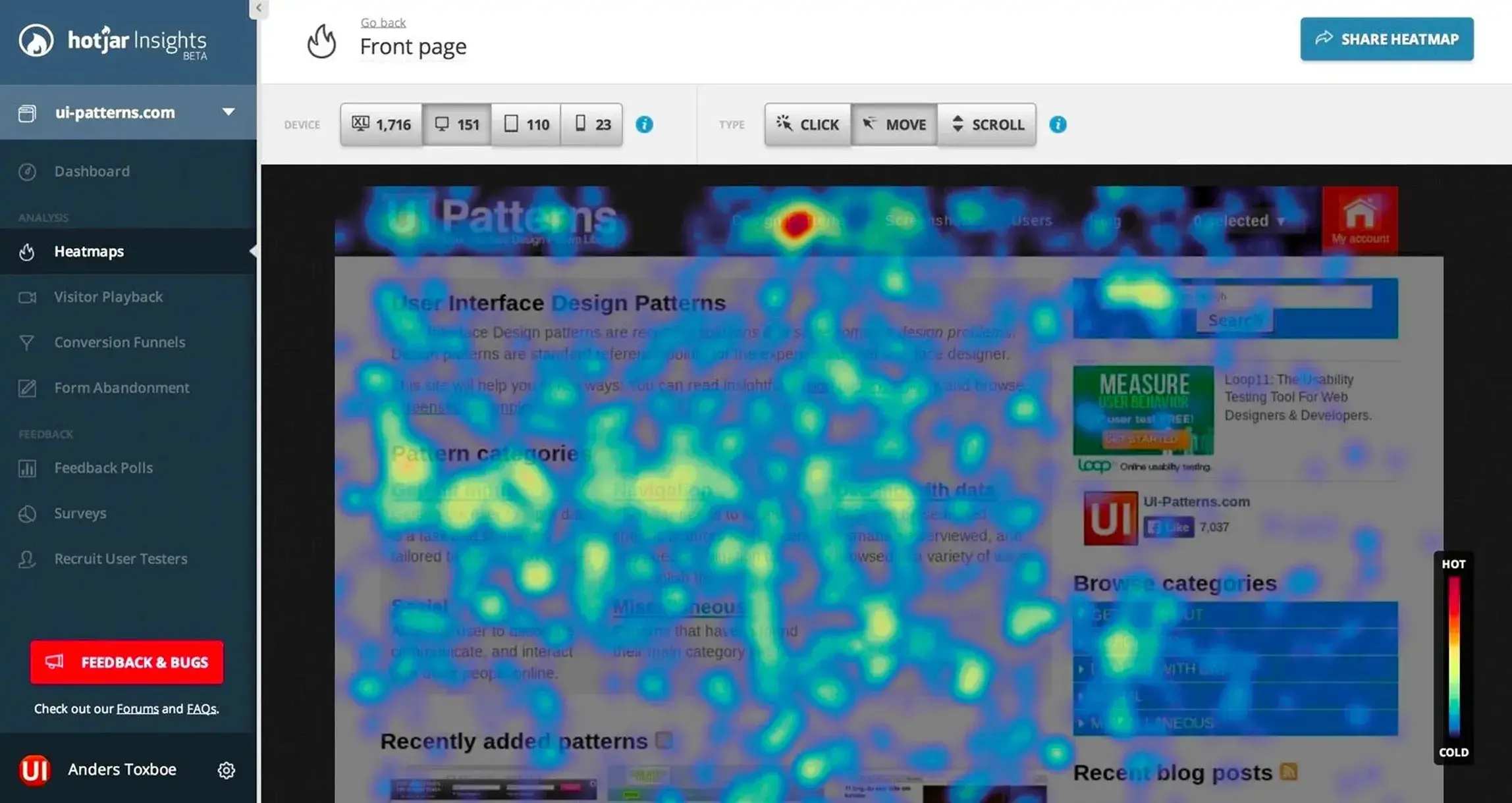
1. Hotjar
The Hotjar heatmap is well known for its click, scroll, and movement maps along with session recordings. Its user-friendly interface and robust analytics make it ideal for both beginners and professionals in UX design.
2. Crazy Egg
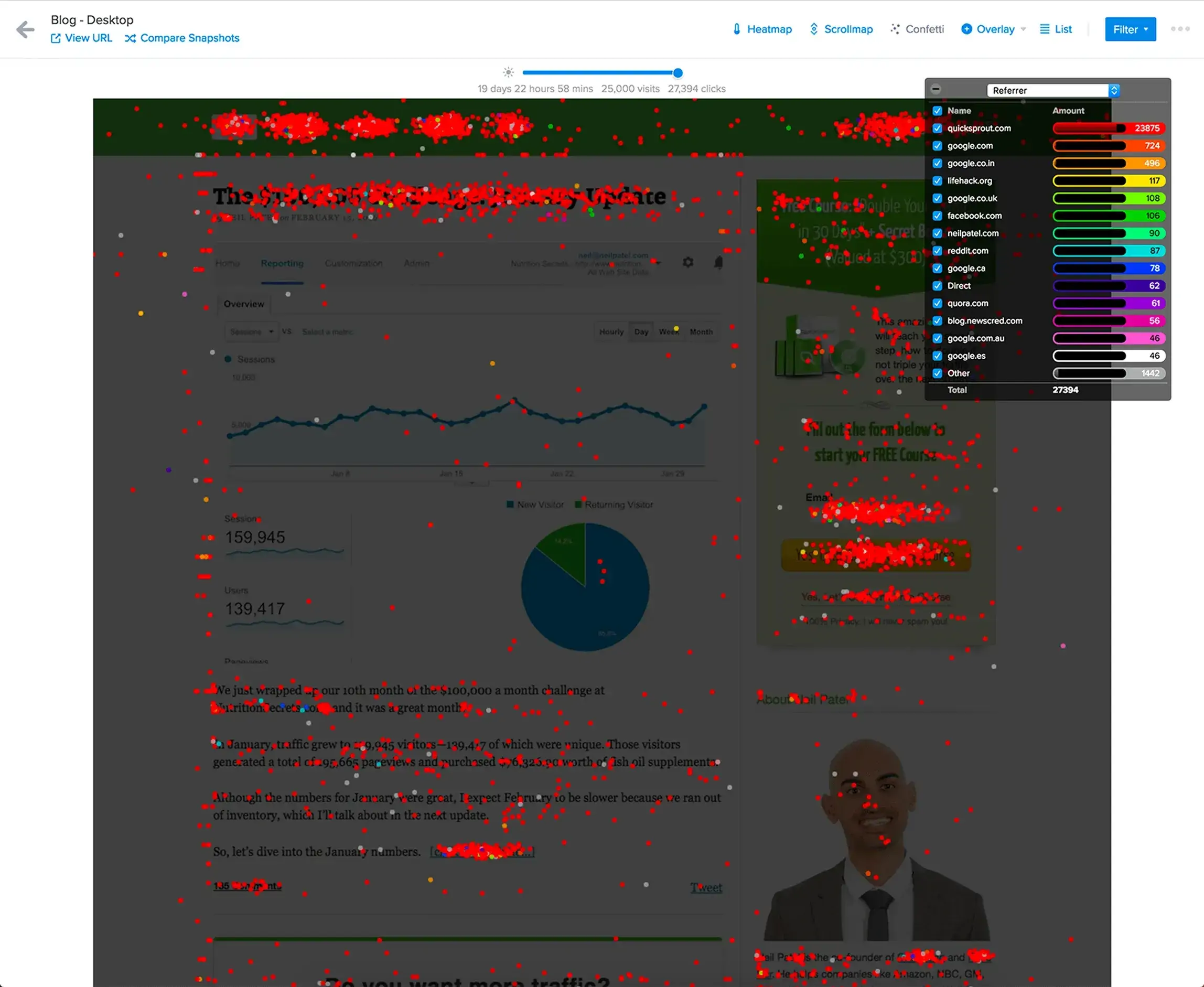
Apart from the Hotjar heatmap, Crazy Egg users can also conduct A/B testing and retrieve powerful reports. Confetti is Crazy Egg’s trademark tool that distinguishes clicks from different traffic sources so that you can see how various groups’ audiences engage with your site.
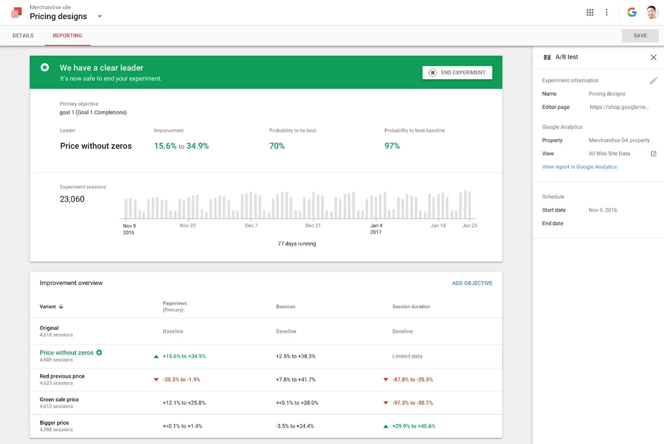
3. Google Optimize
You can get Google heatmaps for free and Google Optimize is the ideal tool that combines with Google Analytics. Additionally, Google Optimize allows users to modify several layouts for increased UX optimization.
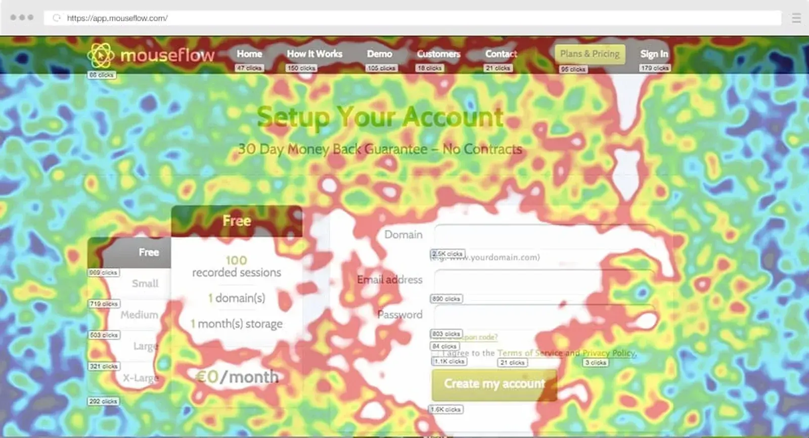
4. Mouseflow
Mouseflow is for eCommerce businesses that want to examine the checkout process with full session recordings and heatmap analysis. Mouseflow also allows for advanced filtering of specific user segments.
Conclusion
Heatmaps have changed the way we do UX design by giving us a visual way to understand user behavior. Instead of just numbers or abstract metrics, we get a clear picture of what works – and what doesn’t – on our websites.
By finding areas of high engagement and uncovering pain points heatmaps allow businesses to make strategic user-focused improvements. Removing complex navigation, improving content visibility, or optimizing CTAs are all decisions that can be made based on heatmap insights.
Using the Hotjar heatmap, Crazy Egg, or Google Optimize makes it easier than ever to add heatmap tools to your workflow. So take the first step today – start analyzing user interaction and unlock your designs.
References
https://vwo.com/blog/heatmap-and-ux
https://www.qualtrics.com/experience-management/customer/website-heatmaps/?utm_source=chatgpt.com
https://userpilot.com/blog/heat-map-analysis/?utm_source=chatgpt.com